28 April 2022

Blendability

Blendability is an important skill, though not appropriate in all situations.

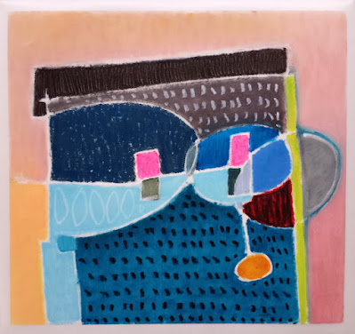
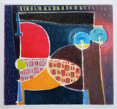
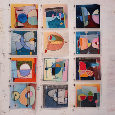
Verna Vogel oilstick on duralar colourful abstract images

I've discovered that matte Duralar is a wonderful surface to work on with oilsticks: smooth but not slick, very good for blending and wiping effects.  I have it on good authority that you can use solvents with it, too, but since I am determined to be totally solvent-free in the studio I have not tried that.

Verna Vogel oilstick on duralar colourful image

Desaturating the images, I find I like them alot in black & white... but I've yet to make any really successful b/w artworks, though.  My persistent love of colour gets in the way *laughs*

Verna Vogel oilstick on duralar

Somewhere, somewhen, I read that muted colours (ie: greys & taupes) are considered more civilized, and colourful colours more savage, so to speak.  I imagine that would be tied to how close to the surface one's emotions are allowed to be in a given situation.  Today's home designers certainly encourage a very limited palette in narrow tonal ranges, for the most part.  There's blendability for you.

My brain understands the muted logic, but my brain does not rule in the studio.  Colour brings me joy, and it seems to bring other people joy, too.

Verna Vogel oilstick on duralar colourful image

If the point is to shine a light in dark times, bring on the colour, I say.


P.S. Click here to see water-based media on clear, glossy duralar, it's the second image in the post.

P.P.S. and a link to a subsequent post showing photos of the exhibition installed.  A good memory...  I hope to be able to create immersive exhibitions again, in fact have got some work already headed that way, and a possible venue for it too.  More about that later, though.  ;-)


22 March 2022

modifications

Further development of this painting.


before


after

I think I will leave this one now and move on, 
having learned something in the process.

Thanks for reading, and looking  :)


06 March 2022

Little Fishes

Feeling a bit low-energy lately.
Taking images of unsatisfactrory paintings and running them through the photoshop, with I think some interesting visual possibilities.

before...

...after

One large change + a few small tweaks.
Well then!  Perhaps then I will not gesso over this one, but rather try re-working it a bit.  :)


02 March 2022

Homeostasis in the big picture

Since January 1, 2022

-- when one of my studio heaters kaputzed and it was impossible to find another after a very cold christmas, so I removed my acrylics (which must not freeze) into the house, but wanted to work in the studio even though it was cold --

I have been painting with oils, which are less temperature-sensitive.
Solvent-free!
A real learning process for me.
After some sucesses with smaller canvases, I went larger, and have run into problems.  Go figure.  *laughs*

This painting, for example....


... began with a really well composed drawing.

This is not easy for me to do on a large scale, and I was feeling quite good about it.
(it's 38 x 68", or 95 x 175 cm)

Under the darker lines, there are paler lines.
When applying the colour, I decided to follow some of those paler lines.


Yeah, not such a good idea.

Why not?  Well....

It's busy, no focus, no smooth leading of the eye: lack of flow!
The pattern is too evenly spaced: homeostatic conditions!
I lost sight of the big picture, of the elegance and simplicity of the initial drawing.
Defeated by size.

I could not see these problems, and fudged around with ir for a long time.
Nothing worked, things only got worse.

Until....


! AHA !

So I ran the image through photoshop.
My pruning was ruthless.
Now I know more-or-less what to do with it in the studio.
Sweet relief.
Thank you Robert Genn, and Photoshop.

And thank you, dear Reader, for reading.
Perhaps some of you will find this post useful.

p.s.: I did eventually find another heater, so I'm no longer painting in the cold.
:)