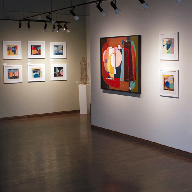
I finally did it!!

The Drop, 8x10"
I signed up for the Not-So-Mini print exchange and exhibition, a yearly event at Alberta Printmakers.
Though I have known about this event for years, this is the first time I actually submitted an application, and made an edition of 10 prints, and got it to them on time.
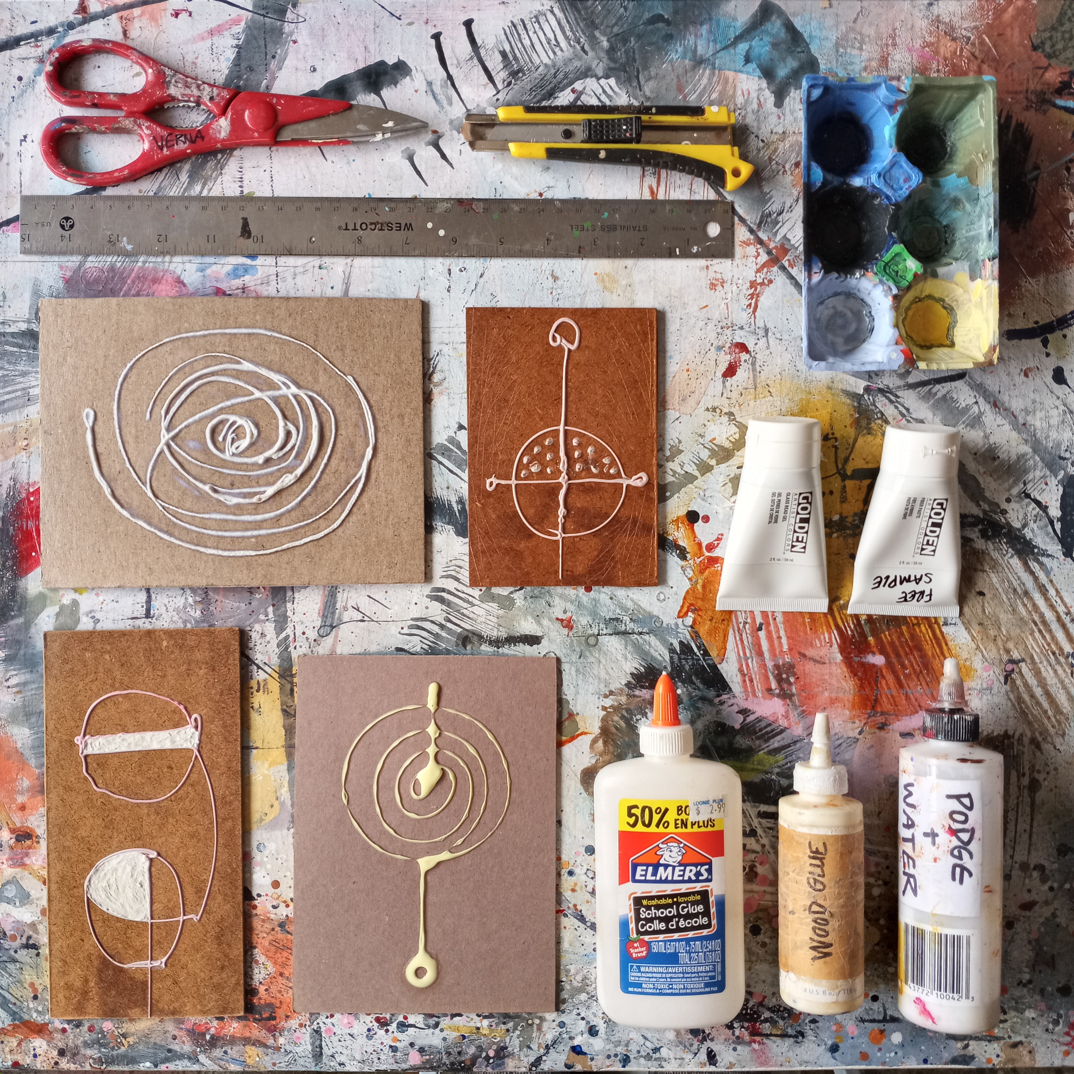
Here are a few simple collagraph printing plates I made, not yet dry.
I used cardboard, glue, a couple of highly textured acrylic mediums, string, and mod-podge to seal the plates once the collages had dried.

And here is my painting table converted to a print workshop.
I made these prints on rice paper that I purchased when I lived in Malaysia almost 30 years ago. The paper is excellent, and it was a joy to use it for this project.
It's been several years since I did any sort of printmaking. It's always such a fun and magical process to spend time working on an object which is not the final iteration, as in painting. Instead, the plate is a means to an end: the image transferred onto a piece of paper.
That feeling when you pull the first print, it always contains an element of surprise.
I love that.

I liked the prints I got off this plate the best ...

... And so that became my edition.
I actually made about 20 prints in order to get 10 that were fairly consistent.

Once the prints were fully dry (a day or two) I packaged them between 2 pieces of acid-free matboard, with acid-free tissue between each print.
I find it interesting that pretty much any sort of materials can be used to make a collagraph plate, but then the prints are made using archival inks and papers, and are packaged and protected so that the paper won't discolour or sustain other types of damage.

A well-packaged print edition on its way to Alberta Printmakers.

Printmaking is a fundamentally simple idea. Although some of the processes and techniques can be quite complex, it's also possible to get a pretty nice print in a very simple way.
Re-visiting the humble collagraph for this project was a great pleasure.
Thank you once again, dear Reader, for your interest.